HW 12 - Discord
Successful design that ignore color theory:
 |
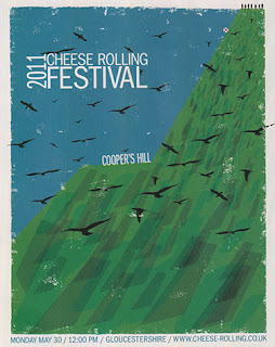
Communication Arts, November/December 2017, page 144
The color green, commonly associated with life and vitality, is used in an ominous advocacy campaign. The color use is still successful because instead of a bright green forest, a darker shade is used.
|
 |
| Communication Arts, November/December 2017, page 102 This poster uses complementary colors in high saturation. It's effective in part because it reflects the absurdity of the poster topic, and darker hues and a less saturated blue background balance the bright reds, pinks, and greens. |

Comments
Post a Comment